


How To Design Fascinating Icons for UI UX Design
Dec 17, 2021
UI designers are very creative in their work. They are known for delivering attractive design work. Though they work very dedicatedly, they need some guidance from the user as it will help them to enhance their work.
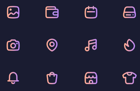
Sometimes simple Icon gets more attention and looks more attractive. Simplicity gives great satisfaction. Don’t overcomplex your icon designs. Choose a design that is so simple, especially at smaller sizes. The best icons for ui ux design are simple shapes and pictograms that users can instantly identify.
Icons should be easily recognizable so that anyone can access the function associated with them. It does not make any if a user is unable to understand the Icon. It became mandatory to design an icon in such a way that its purpose is defined just by a single look and this will improve the overall efficiency.
The images used for icons should be appropriate and meaningful. The Icon’s meaning should be directly conveyed to the user, such as a house icon for the home page. While metaphors are sometimes easily deciphered by users, more literal icons are generally faster to recognize.
Icons for ui ux design are often used in small sizes, but you may occasionally find use cases where you want to use larger versions (or even smaller ones). For that reason, make sure that your icons look good regardless of the size they’re displayed at. You can use progressively more complex icons as the size gets larger, but make sure that you don’t let them get too complicated.
If you’re not using text labels to accompany your icons, make sure you provide suitable relevant keywords so that screen readers can still use them.
In a similar way, make sure that your icons have enough contrast and are easily accessible. You should also make sure that the Target Audience can access the feature without having any difficulties.
In general, single color should be used for Icons. Also, different colors for each of your icons should be avoided unless it directly contributes to making them more usable. There are some cases where you might use a different colors Icon to highlight its activeness, while the rest are another color.
Choosing a unique approach and great quality resources is always preferred by UI designers. A vector image format is advisable for designing an Icon. This is how you can deliver high-quality solutions. When saving them for use in digital products, the SVG file type is the best choice as it preserves the scalability of the icon as well as transparency.
We can also save them as an alternative to SVG and i.e PNG, as they’ll retain transparency and the quality won’t be affected.
Your icons should be uniform in style and size. Using an inconsistent pattern can confuse users and it will become so messy. Using icons that aren’t the same size will have a similar effect.
When it comes to size, though, aesthetic weight takes precedence over precise pixel proportions. To that purpose, you might create icons that are slightly larger than heavier icons but have a lower visual weight.
Consider the difference between a star and square icons. Due to its more solid appearance, the square will appear to be larger if you make them the exact same pixel measurements. You can make icons that appear to be the same size by extending the star’s arms slightly beyond the square’s dimensions. Just make sure they’re all in containers that are the same size to ensure correct placement and spacing.
Users should not be left in the dark about what an icon is or what it represents. Make sure the iconography you employ is easily recognizable central by consumers so they don’t have to guess what your symbols are supposed to be.
You should also double-check that the functions your icons represent are obvious. Consider adding text labels to clarify what the icon performs if you’re not using universal icons (we’ll get to those in a minute). It’s quite useful for new users and ensures that they don’t get confused about what the various icons mean.
Don’t try to reinvent the wheel when it comes to iconography. Unique, imaginative icons may really spice up your user interface. However, if people don’t grasp them or find them difficult to comprehend, you’re degrading the entire user experience.
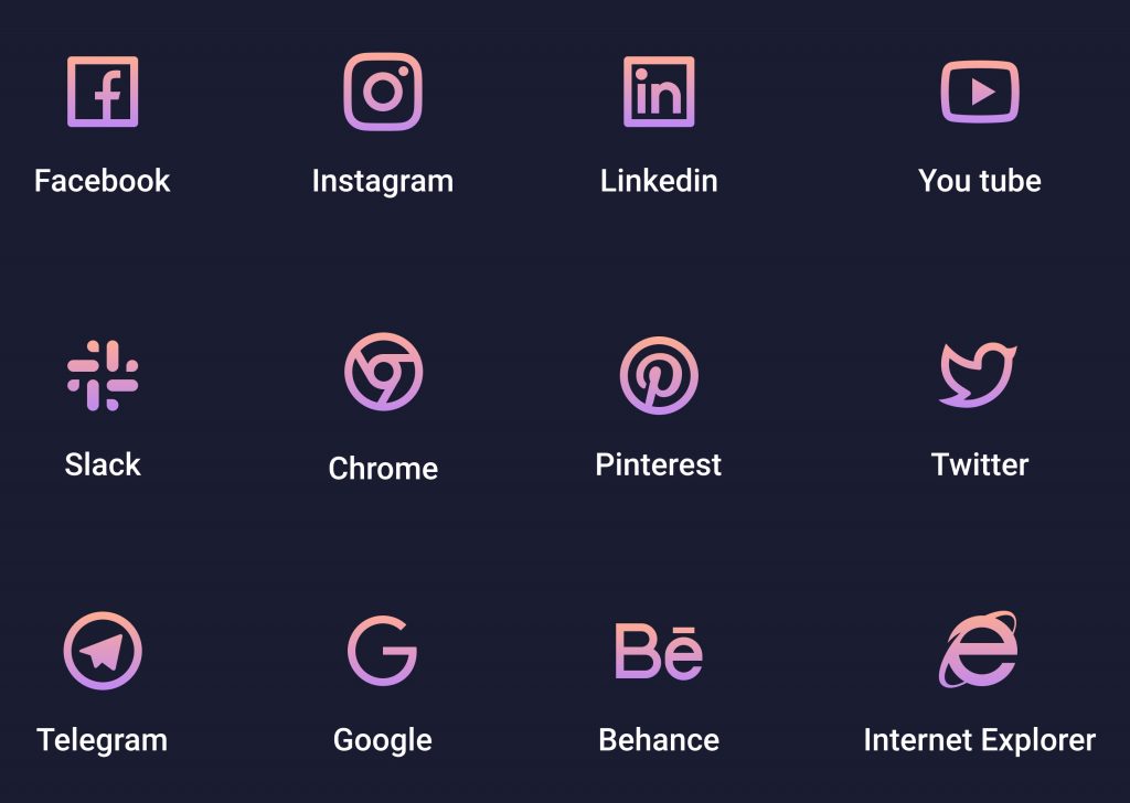
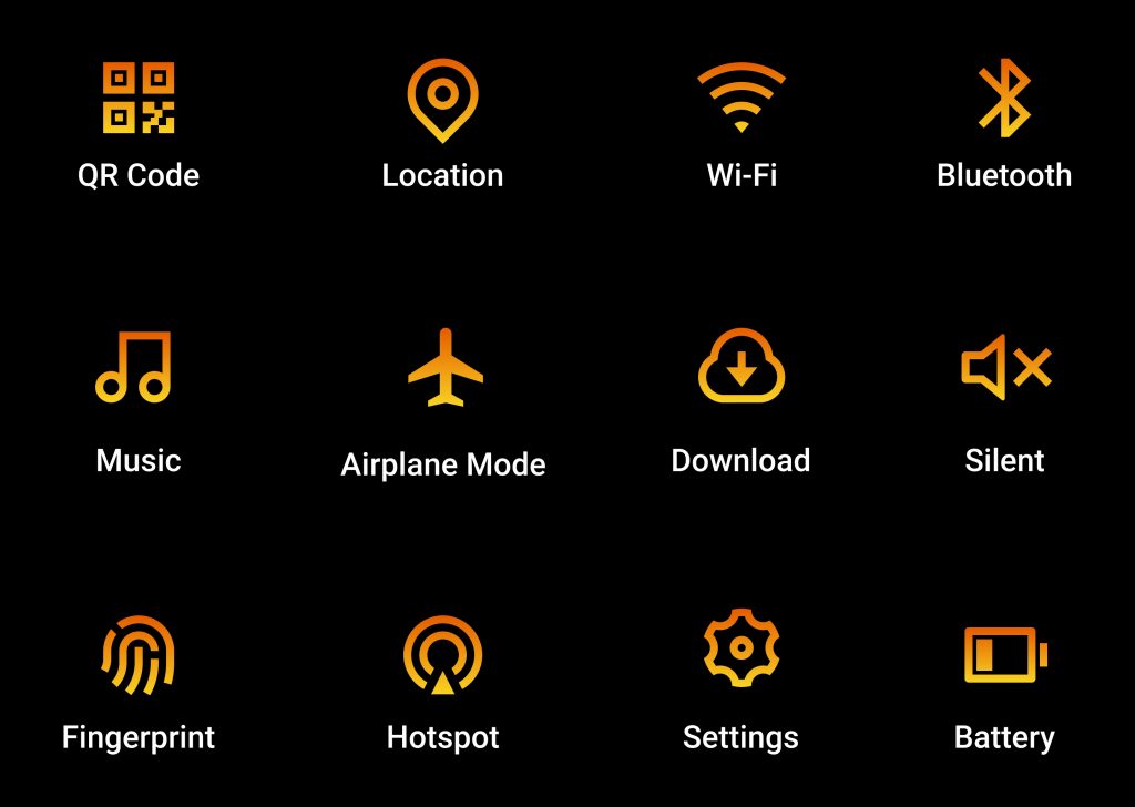
Here are a few examples of globally identifiable icons:
It’s generally advisable to utilize a universally known icon if you’re employing the features indicated in the list. If you don’t want to utilize a universal icon, add a text label to help users.
Not every User Interface design needs to include icons, but when used properly, they can improve the user’s experience while also providing additional aesthetic appeal for your websites and other digital products.
UI/UX designer for hire from Infiraise to fulfil your needs.
Developed by Sun Micro systems in 1995, and currently owned by Oracle since 2010, Java is one of the most used programming languages by developers. Most of the applications and…
Despite their similarities, the distinctions between JavaScript vs TypeScript determine whether one is truly superior to the other. This article aims to describe the current main differences between the two…
What is Angular Development? Angular is a web-application framework written in Typescript. It is led by the Angular team at Google, along with other individuals and corporations. Angular is by…
Let’s get in touch